Preface
I have been one of Philippe-Olivier Crépin (PEX)’s live-stream viewers and subscribers for quite some time and recently I was tasked with the re-work of his live-streaming brand, one of the first time I’ve worked on a brand that wasn’t mine.
To achieve this I teamed-up with Jolyanne Du Cap (ColorJunkie) which has good experience as a graphical artist and branding in general and with whom I worked with in the past on multiple projects.
The beginning
The general feeling that his old image told was; roughness. Which was in accordance with the game he is playing during his live-streaming sessions (Counter-Strike: Global Offensive), but didn’t fit either Philippe-Olivier’s personality nor the message he wanted to share with his viewers.
With that in mind, we started by defining the most important part of his new brand, the conveyed image. After going through a few sessions of brain-storming we held on the key-words; clean and simple.
The next step was to define the key colours. We did not want to go too far from his previous colour scheme (red and black) as we wanted to keep a sense of continuity, so we choose to stay within the same colour ranges, but we would make greater use of secondary colours. So we went with a darker red, white elements and grey variants if the scene required it.
Building the logo
At first we wanted to do a logo that had a unique look among other live-streamers, so we went with a logo that represents Philippe-Olivier’s style as the first iteration (The Afro and the headset). We later decided to head towards something that better fitted the wanted theme of clean and simple with a typography logo. Jolyanne created this custom font to bring up-front the uniqueness of the logo.
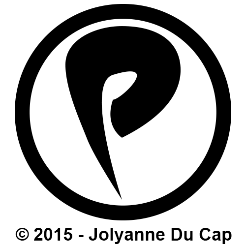
The icon was one of the logo’s iterations, but was later replaced by the final logo. We still decided to keep it as an icon because it better fits as a smaller image.
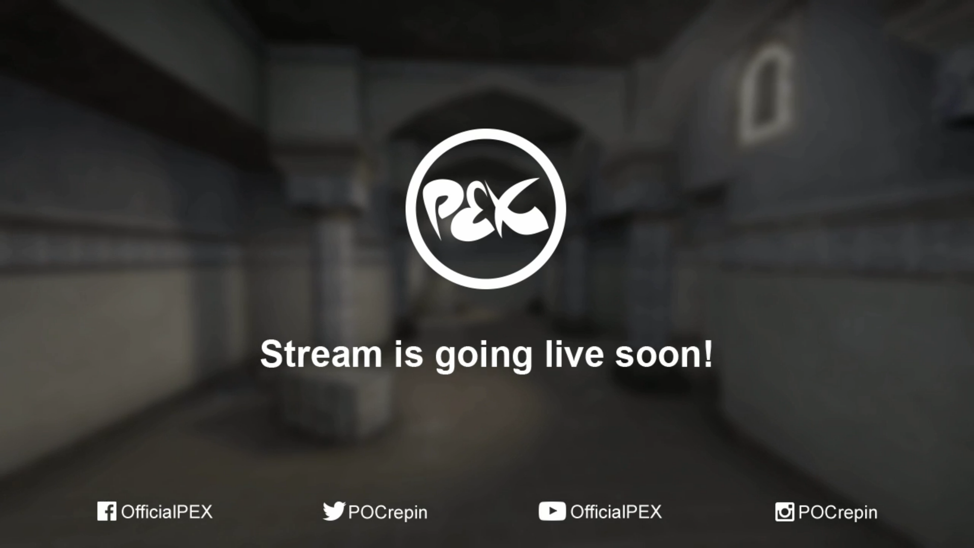
For the logo, a white variation was created for use with darker backgrounds, and the red variation would be used for everything else.
The overlays
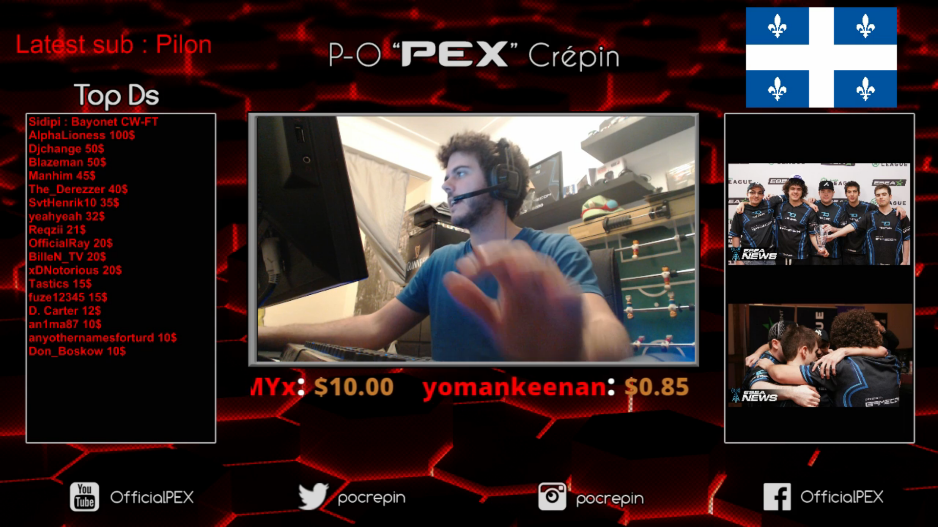
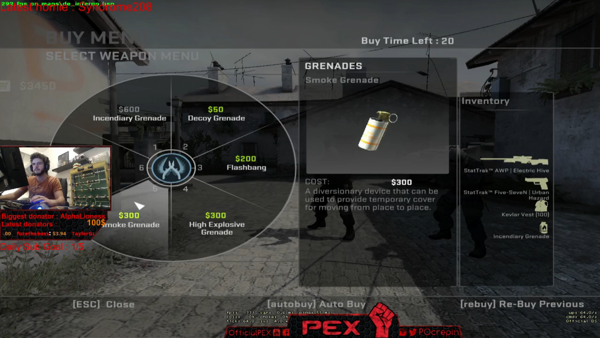
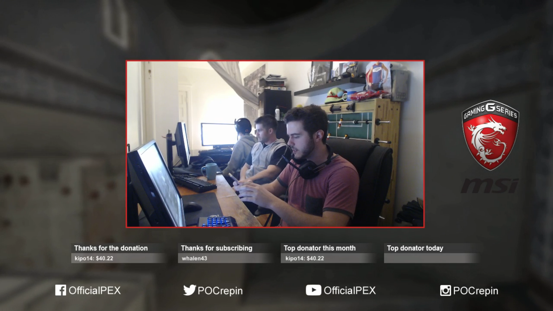
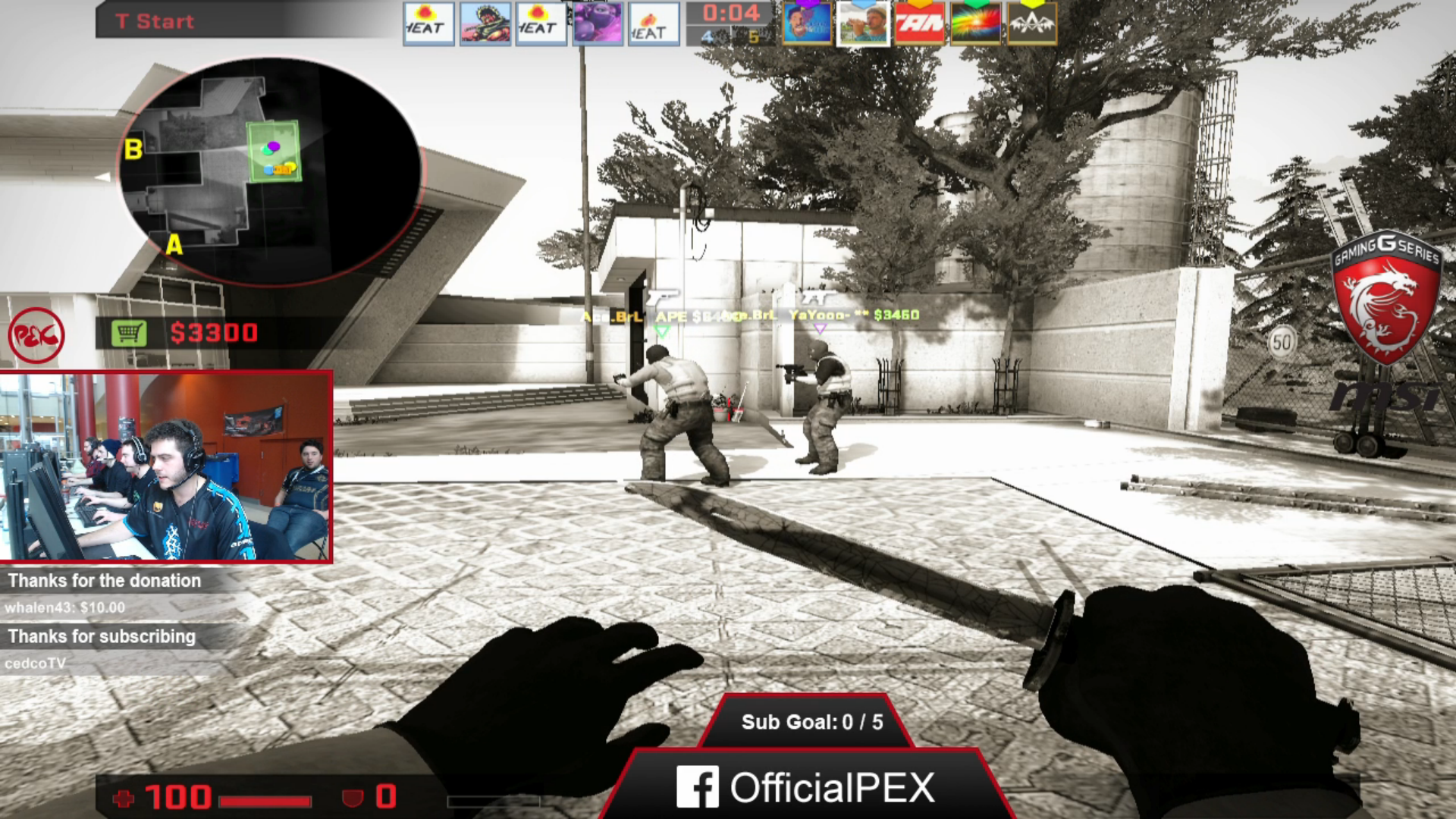
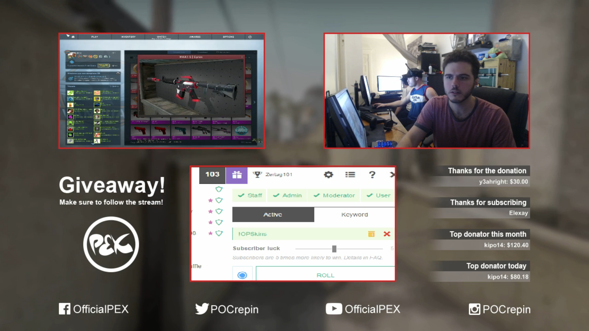
For the live-stream overlays, we wanted to go with something that was very minimalist, so we went with very clean and simple interfaces with the minimum amount of information to be useful while live-streaming.
Multiple scenes were made, including;
- Going Live, Break, and End of Stream
- Full-screen webcam
- In-game
- Giveaways
Video background
The video background was an idea I had some time ago that I experimented with on my own personal live-stream. I found that it is a nice way to keep scenes from being stagnant.
To produce that I went into Counter-Strike and used different time-flow commands in order to slow everything down, and using a spectator camera view I recorded the footage while moving slowly. The original video I made contains approximately 45 minutes of footage.
After taking all the footage and editing them together, I added various effects including exposure, blur, and colour correction in order for the background not to pop-over the content.
Social medias branding
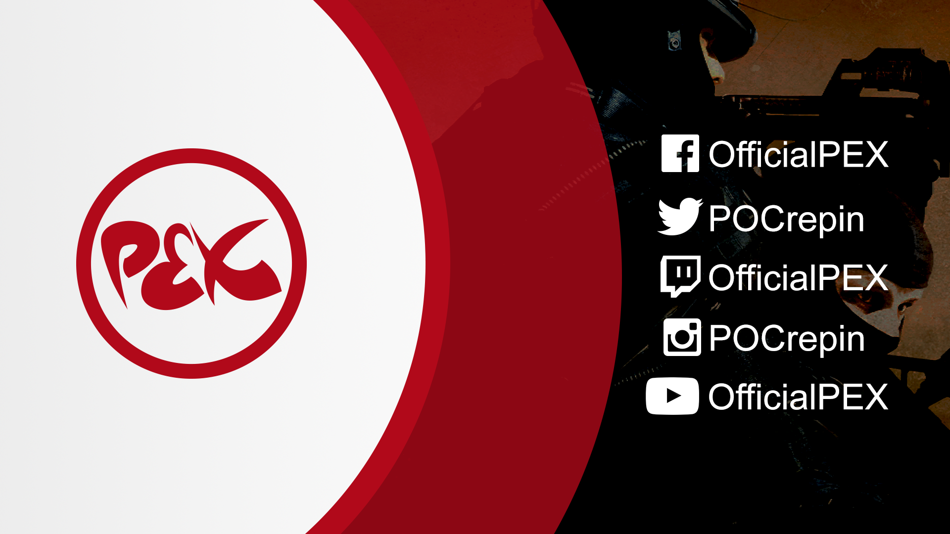
For general images, we decided to go with a prominent logo and social media information and use some images from the game he plays. The image used is easily replaceable with new content in order to keep everything fresh and new.
Most of the other social media elements are still being worked-on as I am posting this article and will receive their share of branding soon in order to have the most branding continuity.
What’s next
Our work here isn’t completely finished as we have many other ideas in head to help improve and maintain Philippe-Olivier‘s live-stream.
We are planning on finishing all the social medias branding including Twitter, Facebook, and YouTube as well as keep our creativity going with new elements to add to his live-streaming sessions.
Conclusion
Working on all that have been quite challenging as it’s not what I do in my everyday moments. I usually lie in the darker corners working as a back-end developer always waiting for the next challenge. But I must admit that I had quite a lot of fun working on that, therefore you may see more creative work from me in the near future.

